I do not believe I could have chosen a better course to end my university career with. Being in MIT, I have learned to be aware of the construction of meaning and the associations that people attach to texts. Despite this, Visual Analysis has taken my critical awareness in a new direction. For one, choosing my own images of interest has made the course very enjoyable and geared toward my future ambitions. The blog has been a positive addition to my online portfolio, which seeks to display my skills to advertising sales and marketing professionals. I was able to keep this project in mind when I selected images that reflect my interests and personality. I have not taken any other courses that have allowed me to choose the assignment that I prefer to complete. The visual articulation project was especially significant to me, because it allowed me to spend time searching for images of my family and to represent my understanding of the era in which my parents grew up.
I have not taken any MIT courses this term, since my requirements have been completed. Taking solely writing courses has been a definite change of pace, and I loved that this course incorporates both my passion for writing, and creative studies in an academic format. The class has challenged me to a great extent. At times I found that I was not effectively conveying the meaning I wished to dissect in a very clear manner. Writing about visuals can be a difficult task.
I realize now that there is always additional meaning behind an image, no matter how much you might think you have a certain message or argument figured out. In discussion I was often surprised at the meanings my classmates uncovered. In my larger MIT classes I have not had the opportunity to analyze so many images in a group. I took notice to the progression that the class made in better understanding the argument that images represent. The class as a whole became increasingly critical and aware of manipulation.
Instead of an image that strategically constructs an argument, I wanted to include in my final post an animated image that best summarizes my learnings in this class.
Here, George Clooney shows an awareness of the nature of the media industry as a realm of constructed meaning, in which he is merely a device to help form an argument for a product. This representation urges its viewers to have a more critical eye and question even those things they find appealing.
Thursday 5 April 2012
Thursday 29 March 2012
Film Clip: Garden State Wallpaper Scene (Blog 6/6)
http://www.youtube.com/watch?v=1o-fUAbIXG0&feature=endscreen
The portion of this clip I wish to consider starts at 7:30 minutes. Zach Braff's character, Andrew, has just returned home after receiving news that his mother has died suddenly.
The blending of Andrew's body with the wallpaper in this clip visually represents the ambiguity he feels regarding his mother's sudden death. He is heavily medicated and close to feelingless. He stands in front of this leafy wall, his sick mother's last and only spark of interest, and cannot locate himself. As his mother's friend explains, the shirt was made from the same fabric that his mother had chosen. His facial expression clearly shows no interest in the shirt, and he does not even respond to the irony of this reflection. This scene visually depicts his inability to understand his mother's motives. It is later revealed in the film that Andrew believes his mother has killed herself as a result of her handicap, a disability that he regards as his fault.
The choice of wallpaper represents home for Andrew. He has returned to New Jersey, known as the garden state, from New York City. The busy city of New York has perpetuated his disconnection with reality and his own feelings. He does not have an understanding of home, let alone any fond memories to recall. His reconnection with his family, the state he grew up in, and the house he once called home has not been a voluntary choice. This scene powerfully depicts his immersion into his past, while at the same time conveying to the audience his feelings towards the place artfully, within the first 8 minutes of the film. I thought this was a great example of visual rhetoric that speaks louder than scripted narration to establish character and setting early on in the film.
Friday 23 March 2012
Documentary Photo: Starving in Sudan (Blog 5/6)

http://www.flatrock.org.nz/topics/odds_and_oddities/ultimate_in_unfair.htm
This Pulitzer Prize winning photo was taken by Kevin Carter in 1994 during the Sudan famine. The photographer circled the boy for 20 minutes hoping that the vulture would spread its wings and fly away.
The angle of the photograph prioritizes the small child as the subject to be considered by the viewer. It allows for the viewer to see the look of despair on the child's face and the severity of starvation that he has been subjected to. The angle makes the vulture appear even closer to the child than would seem if the photo was taken with the vulture directly behind the child. The child's size is comparable to the vulture's which effectively conveys to the viewer that the child has been reduced to a bare animalistic state.
The child's legs appear to have buckled under him and his head is held up by his hands in a way that indicates defeat. He is noticeably aware of the vultures presence and, like the vulture, awaits his own imminent death. The photographer has skillfully left a lot of territory exposed behind the vulture to indicate the degree of desolation that the area has been stricken with. This image generates a powerful emotional response from its audience. The viewer of this photo is left with a need to know the fate of this child.
Tuesday 13 March 2012
Research Paper Topic Proposal
http://www.youtube.com/watch?v=NoKSL8eBrW0
I want to do my final research paper as an analysis of television advertisements for prescription drugs that do not tell you what they are for. I want to determine the persuasive advantages and disadvantages of this advertising tactic, and it's overall effectiveness.
Since the paper is research based, the majority of my research will be on why this tactic is used. From the research I have done so far, I know that one of the major benefits of not listing the purpose of the drug is that the company does not have to list any major health risks related to taking the drug. The FDA has not required pharmaceutical companies to list all side effects since 1997, but still require that any major health risks be listed and that an 800 number is listed. Many companies can avoid having to do this by listing only the drug name, or the disease or illness the drug treats. I have to do more research on the kinds of regulations that Canada enforces for prescription drug ads.
The other major area I will research will be the effectiveness of these ads. How many people ask their doctors about a drug after seeing an ad like this? What percentage of these people might actually find the drug of benefit to them? These are the questions I seek to answer.
My goal is also to dissect the rhetorical function of the advertisements to determine the degree to which they are persuasive. I hope to determine how these ads strategically foster brand recognition by attaching positive associations to the brand rather than factual information. One of the products I will be looking at is the TV ad for Latisse that uses an attractive woman who simply announces, "I use Latisse." I have not been able to find this advertisement on YouTube, so I may have to record it to show it to the class.
For the multimedia portion of my presentation I plan on using a PowerPoint because this is the best medium for streaming shared videos. I will only show one advertisement because of time restraints. I may ask the class to discuss the Yasmin birth control advertisement above.
Tuesday 6 March 2012
Ad: LEGOVader (Blog 4/6)

This ad is part of a social media advertising campaign by LEGO that places LEGO creations amidst popular landmarks or simply in unexpected places, like this parking garage. Visually, Darth Vader's mechanic and rigid body stands in for a parking machine and his light saber is the parking gate arm. The futuristic figure works well visually and functionally as a stand-in for the mechanic device.
I really like this advertisement because it is unusual that it features no logos or text at all, except for a LEGO banner that was accompanied above it. As a social media campaign I think it works well because it is something that one would come across online. Leaving out text that prompts the audience to buy makes the image more intriguing for the viewer. I think ads that are only visually intriguing work well because they seem to blur the lines between the publisher of the image and the viewer, who has more power in making meaning from what they observe. It is fun, playful and fresh, and this comes across in the visual composition of the piece.
The yellow painted line on the pavement guides the eye toward the arm. The audience is visually experiencing the unusual presence of Darth Vader as a passenger in a car moving approaching the gate. The lights along the concrete wall make it clear that the tunnel narrows and will lead to an unknown end that Darth Vader guards access to. The lights appear to be turned off and only the glowing red light that reflects off the pavement makes this area visible. Positioning a car right behind the gate makes the possibility of entering into the alternate world a reality. The adventure is not only attainable and possible in this ad, it is immediately imminent. This adds to the playfulness and imaginary aspect of the advertisement. The audience is left asking, what happens next, and what exists beyond the gate. The skillful darkening of the tunnel and curve of the wall heightens this "need to know".
I think this ad works really well for the LEGO brand. Beyond the fact that it is playful and imaginary, which is logical for a toy advertisement, its pairing with the popular saga is visually and ideologically perceptive. The colours and lines of this mundane real-life parking garage scene mimic that of the futuristic world of Star Wars. It is as if the audience is entering the modern world of technology, which works to benefit the LEGO brand by bringing the classic toy into the modern day. The associations the audience makes just by pairing LEGO with Star Wars works positively to make the toy a timeless, yet fresh and innovative product.
Tuesday 28 February 2012
Topic Proposal - Visual Articulation Project

I've chosen a line from a song by Seabear titled "I Sing I Swim". The line is simply, "you've got a diamond under your skin."
The lyric seems to make a brilliant diamond, a jewel I've always felt to be too polished and mature to wear myself, kind of worn and comfortable. The line captures the feeling of understated beauty for me, and the kind of appreciation that comes with true love. The reference to a diamond strikes me as timeless.
I want to try and get my hands on some old albums of my mom's from when she was around my age. I think the lyric captures the beauty of Canada's north, so I know my mom has some great shots of her and my dad up at our old cottage in the 70s. I want to try and use my parents because I've never seen them as romantic, but more friends that appreciate each other. I don't know what I'll find but I may have to use some other photos of cottage country like the one above.
In terms of materials I'll probably make copies of the photos and make a collage. Any additional photos will have to complement the vintage, timeless feeling I'm trying to capture. I will focus on the symbolism of the diamond and the effect its integration with something more organic has had for the listener visually.
Tuesday 14 February 2012
Fashion Image: Prada Spring/Summer 2011 (Blog 3/6)
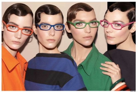
The image above is from the Prada 2011 Spring/Summer campaign. Interestingly, I think the argument behind this advertisement is that dressing in this way represents an expression of individuality and intellectualism. Each woman exhibit the same strong, symmetrical features and don a knowing gaze. The audience is given the impression that the women share a secret. In this sense the appeal of the image is exclusivity.
This image represents the contradiction that exists in fashion. While clothing and accessories appeal to people because they can express their individuality, at the same time, there are rules in fashion. These girls are in the know of the guidelines. The model's hand on the far right guards their well-kept secret and entrance into their elite class.
Each model is styled in an androgynous way. The clean lines of their structured outfits are not revealing. Their glasses frame unembellished eyes and their lips are nude. Their hair is elegant but distinctively masculine. Even their eyebrows are groomed but somewhat unkempt. The advertisement is undeniably masculine, but each of the women has consciously made a great effort to appear this way. Each outfit is colourful, but not playful or feminine, as one would expect for a Spring/Summer line. These outfits are fashionable, but noticeably functional, as well. The constructed image, or argument of this "dress code" is that of empowerment. The women are successful, powerful, and knowingly beautiful.
Tuesday 7 February 2012
Art and Ownership: Banksy's "Shop 'til You Drop" (Blog 2/6)

http://hypebeast.com/2011/11/new-banksy-works-in-london-shop-till-you-drop/
There are many words to describe Banksy's work. Culture jamming and graffiti art are probably among the most fitting. I wonder, what is the extent to which this work can be deemed art? I expect that most of the class has heard of Banksy, however, the main point of his anonymous work is to counter the corporate media's influence. Banksy uses public spaces like sidewalks and ATMs and turns them into a piece of "art". The image above features a woman dressed in a skirt and high heels plummeting from a building at least six-stories tall. The image appeared in mid-November before the holiday season in London, England. The woman is faceless and shadowed, depicting her ignored identity in the face of advertising and consumerism. The goods in her shopping cart seem to be dragging her down. Nevertheless, she maintains a tight grip on the cart and the goods it carries.
The reading from class today, “Definitions of Art and the Art World” by Mulholland, discusses the historical notion of art. The reading discusses two of the recurring themes of the class that relate to Banky's questionable art form. Two aspects of art that determine its merit have historically been ownership and whether it prioritizes form or function.
Banksy presents
a complicated case because he does not seek to claim ownership of
his work. The Mulholland reading explains that Michelangelo's work on the Sistene Chapel was artful due to the authority that Michelangelo maintained through controlling the intellectual content he produced. In Banksy's case, his style of anonymous street art is frequently copied. If you Google nearly any of Banksy's graffiti art pieces there is at least one source
that claims that the piece is not a Banksy original.
Banksy's anonymity says a lot about his philosophy of what constitutes art, which brings one to question whether his work prioritizes form or function. For Banksy, clearly the message, or function, of the artwork is what matters. Publicity is central to the works function, which is to influence and have power over the mainstream media. Interestingly, this is done by trying to get the attention of the mainstream media with dramatic graffiti art, like the one pictured above. I definitely believe Banksy's work to be artful, despite t-shirts and posters that profit from his anonymous cause. Do you consider the image pictured above art or vandalism? If you have not seen Exit Through the Gift Shop I highly recommend it!
Banksy's anonymity says a lot about his philosophy of what constitutes art, which brings one to question whether his work prioritizes form or function. For Banksy, clearly the message, or function, of the artwork is what matters. Publicity is central to the works function, which is to influence and have power over the mainstream media. Interestingly, this is done by trying to get the attention of the mainstream media with dramatic graffiti art, like the one pictured above. I definitely believe Banksy's work to be artful, despite t-shirts and posters that profit from his anonymous cause. Do you consider the image pictured above art or vandalism? If you have not seen Exit Through the Gift Shop I highly recommend it!
Thursday 2 February 2012
Topic Proposal - Rhetorical Analysis #1

The cartoon I've chosen to analyze is from a graphic novel called Fun Home by Allison Bechdel. The graphic novel has been labeled a 'tragicomic' by the author as it is a recount of her convoluted relationship with her father. The purpose of this strip is to convey the distance felt between each family member. In my essay I plan on interpreting the purpose of the composition of this piece which works to support the written dialogue of the strip.
Another very important aspect of the entire graphic novel, and this strip in particular is the colour and shading used by the author/artist. The blue colouring and dark shadows set the tone of the graphic novel. The perspective of the comic is very distant, giving the audience an all-seeing advantage. However, the audience reads the strip from the main character's perspective. My analysis will give a brief summary of the graphic novel to give context to the strip and to explain the nature of cartooning that Bechdel feels most drawn to.
Images like this one were extremely impactful on the LGBT community, which made Fun Home an influential work of art. I selected this image as the most effective in conveying the feeling of separation visually. In my essay, I will explain the intended audience of the graphic novel and how I think such an image would be received by both members and non-members of the LGBT community.
I will argue that this is an extremely influential comic due to its appeal to pathos and use of colouring and composition. Furthermore, the most culturally significant aspect of the comic is the connection it successfully makes with the audience. The argument of the text is that we must understand differences in others, and embrace differences in ourselves. I will outline how this image sheds light on this.
Wednesday 25 January 2012
Celebrity of Interest - Lindsay Lohan (Blog 1/6)

This image brought me back to our class lecture on assumptions about high and low art. This image of Lindsay was published by Playboy in a kind of last attempt to save the printed form of the magazine. Magazine sales have suffered since controlling the leak of images to the web was nearly impossible. Sales of the issue have been extremely high, despite the leak of images online.
Needless to say, this was a big issue for Playboy, and what better way to 'go big' than to use illusion to reference Marilyn Monroe's iconic photo shoot. I thought this was an especially interesting image to dissect because the image is arguably very tasteful for Playboys usual style. Lindsay remains unexposed. I thought it was worth dissecting why this image, is so very different from the image to which it is self-referential. For one, the image is associated with Playboy, thereby marking it at low culture to most. The image is undoubtedly artful, but not in the same way the professional photographs of Marilyn were regarded.
Most notably, however, are the values attached to Lindsay. Being linked to tabloid culture, she re-interprets Marilyn's iconic image making it something new. Still, the illusion to the Marilyn is undeniable, which makes the message that the image delivers all the more powerful. Lindsay breathes a fresh sex appeal into it the Playboy brand, while also marking the magazine as classic, even timeless. I thought the image was a very artful use of celebrity culture to make Playboy into so much more than a men's magazine. For me, the reinterpretation was brilliant.
Thursday 19 January 2012
Topic Proposal: Personal Narrative Essay
At first I wanted to avoid representing myself with images because the task of narrowing my identity down to 5 images seemed so daunting. There's still so much I'm unsure about. Upon perusing my iPhoto to music, as I so often do, I decided that there is a definite backbone to my identity that widely determines every other aspect of my life: The women in my family.
I will prepare a kind of timeline that represents the changes in my life in accordance to the changes within our family dynamic.


This photo, taken when I was five, is when we were all together at the beach house in Trinidad where my Dad is from.

When I was seven my parents took my sister and I out of school to live in Germany with my Grandma and Opa so that we could experience Europe. I cried and screamed everyday because I wanted my Mom. My sister took this photo on the only day I was happy when we were playing dress up.

http://starshollow.tumblr.com/
We watched Gilmore Girls every Tuesday for seven years.

After a combined six years of separation with my sister and I attending different schools, my sister set her sights on Asia to teach English for two years with her boyfriend. This is her with their Asian IDs and the last I've heard from her.
This is a picture of my Mom and I in the summer having a spot of lunch at home and missing Nat!
Since these photos encapsulate my entire lifespan, there's too much to say. What I'll primarily be focusing on, however, is the relationship I share with these two VIPs in my life. I'm going to focus on the impact images that my sister has sent me from Asia have had on the perception of her new life overseas. I've had an entirely foreign experience alongside my sister, as I try and construct an idea of the kind of life she is living so far away from us. The few images she sends us are all I have to understand how far away from home she feels, and how different South Korea is. Witnessing my sisters fearlessness not only in moving, but also in the investment she has made in her relationship has led me to realize a lot about myself, namely, that we are more different than I ever thought. In the past year alone I can see how much we have both grown and changed being so completely separated.
To reiterate, these images represent the personal and intellectual growth I've had in accordance with adaptations to my core family relationships. Each photo represents a point in time in which my self-concept was altered. For this reason I'm still unsure about my holistic identity, but am certain of the impact these changes have had.
Thanks for reading and suggestions are much appreciated!
Monday 16 January 2012
Introductory Entry
Hi Everyone,
I'm Johanna and I'm a fourth year Honours MIT student with a passion for creative writing, therefore I'm also working toward my writing certificate. I'll be keeping this blog to analyze various images that impress a certain feeling on the viewer. The purpose of the blog is to take a close look at the meaning of images that impact our daily lives and to dissect the arguments that lie behind them. I seek to understand the emotional reaction and lasting impact images can have on people and to locate the root of such responses.
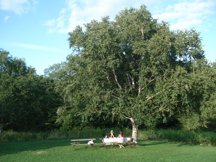
http://pinterest.com/pin/256705247479830499/
This image, from pinterest.com, immediately reminded me of home. I think the image does a great job of depicting the beauty of solitude. While the place I call home is uncommonly secluded much like this, it is the place I best understand myself. At the same time, solitude is the thing I most struggle to find peace in. When my parents moved me from the city in the middle of grade 8 I could not understand their appreciation for such a place. It was not until I spent this past summer in Europe that I began to appreciate the simplicity of home.
For me, home is a place just like this one, only the water is only a small river that is located acres away. The only neighbours I've ever seen are deer and the trees are equally as beautiful in autumn. The river in this picture reminds me of a Group of Seven painting that captures the beauty of Canada.
I always considered myself a kind of welcome alien in my family. Being a hyper-active, outgoing, type-A personality I've always been dumbfounded by the number of hours my family can sit reading or spend outdoors. I felt the urge to travel, live amongst friends and meet endless amounts of new, interesting people. This image best depicts my personal revelation in the past year. I saw a great deal of the world and had an even better experience than I had ever anticipated, yet interestingly, the most life altering thing I learned was that it's okay for life to sit still. While I never expected to take such a lesson away from the trip, it was a pleasant surprise. I based the title of my blog on this to emphasize the way meanings can change and surprise us. While this blog will track my interpretation of imagery, these images are always available for a closer look, and I hope my readers will offer up counter-readings. This image, the still lake and the not-yet fallen leaves, best depict my current self at a welcomed standstill.
Thank you for reading!
I'm Johanna and I'm a fourth year Honours MIT student with a passion for creative writing, therefore I'm also working toward my writing certificate. I'll be keeping this blog to analyze various images that impress a certain feeling on the viewer. The purpose of the blog is to take a close look at the meaning of images that impact our daily lives and to dissect the arguments that lie behind them. I seek to understand the emotional reaction and lasting impact images can have on people and to locate the root of such responses.
 |
This image, from pinterest.com, immediately reminded me of home. I think the image does a great job of depicting the beauty of solitude. While the place I call home is uncommonly secluded much like this, it is the place I best understand myself. At the same time, solitude is the thing I most struggle to find peace in. When my parents moved me from the city in the middle of grade 8 I could not understand their appreciation for such a place. It was not until I spent this past summer in Europe that I began to appreciate the simplicity of home.
For me, home is a place just like this one, only the water is only a small river that is located acres away. The only neighbours I've ever seen are deer and the trees are equally as beautiful in autumn. The river in this picture reminds me of a Group of Seven painting that captures the beauty of Canada.
I always considered myself a kind of welcome alien in my family. Being a hyper-active, outgoing, type-A personality I've always been dumbfounded by the number of hours my family can sit reading or spend outdoors. I felt the urge to travel, live amongst friends and meet endless amounts of new, interesting people. This image best depicts my personal revelation in the past year. I saw a great deal of the world and had an even better experience than I had ever anticipated, yet interestingly, the most life altering thing I learned was that it's okay for life to sit still. While I never expected to take such a lesson away from the trip, it was a pleasant surprise. I based the title of my blog on this to emphasize the way meanings can change and surprise us. While this blog will track my interpretation of imagery, these images are always available for a closer look, and I hope my readers will offer up counter-readings. This image, the still lake and the not-yet fallen leaves, best depict my current self at a welcomed standstill.
Thank you for reading!
Subscribe to:
Posts (Atom)