I do not believe I could have chosen a better course to end my university career with. Being in MIT, I have learned to be aware of the construction of meaning and the associations that people attach to texts. Despite this, Visual Analysis has taken my critical awareness in a new direction. For one, choosing my own images of interest has made the course very enjoyable and geared toward my future ambitions. The blog has been a positive addition to my online portfolio, which seeks to display my skills to advertising sales and marketing professionals. I was able to keep this project in mind when I selected images that reflect my interests and personality. I have not taken any other courses that have allowed me to choose the assignment that I prefer to complete. The visual articulation project was especially significant to me, because it allowed me to spend time searching for images of my family and to represent my understanding of the era in which my parents grew up.
I have not taken any MIT courses this term, since my requirements have been completed. Taking solely writing courses has been a definite change of pace, and I loved that this course incorporates both my passion for writing, and creative studies in an academic format. The class has challenged me to a great extent. At times I found that I was not effectively conveying the meaning I wished to dissect in a very clear manner. Writing about visuals can be a difficult task.
I realize now that there is always additional meaning behind an image, no matter how much you might think you have a certain message or argument figured out. In discussion I was often surprised at the meanings my classmates uncovered. In my larger MIT classes I have not had the opportunity to analyze so many images in a group. I took notice to the progression that the class made in better understanding the argument that images represent. The class as a whole became increasingly critical and aware of manipulation.
Instead of an image that strategically constructs an argument, I wanted to include in my final post an animated image that best summarizes my learnings in this class.
Here, George Clooney shows an awareness of the nature of the media industry as a realm of constructed meaning, in which he is merely a device to help form an argument for a product. This representation urges its viewers to have a more critical eye and question even those things they find appealing.
Thursday, 5 April 2012
Thursday, 29 March 2012
Film Clip: Garden State Wallpaper Scene (Blog 6/6)
http://www.youtube.com/watch?v=1o-fUAbIXG0&feature=endscreen
The portion of this clip I wish to consider starts at 7:30 minutes. Zach Braff's character, Andrew, has just returned home after receiving news that his mother has died suddenly.
The blending of Andrew's body with the wallpaper in this clip visually represents the ambiguity he feels regarding his mother's sudden death. He is heavily medicated and close to feelingless. He stands in front of this leafy wall, his sick mother's last and only spark of interest, and cannot locate himself. As his mother's friend explains, the shirt was made from the same fabric that his mother had chosen. His facial expression clearly shows no interest in the shirt, and he does not even respond to the irony of this reflection. This scene visually depicts his inability to understand his mother's motives. It is later revealed in the film that Andrew believes his mother has killed herself as a result of her handicap, a disability that he regards as his fault.
The choice of wallpaper represents home for Andrew. He has returned to New Jersey, known as the garden state, from New York City. The busy city of New York has perpetuated his disconnection with reality and his own feelings. He does not have an understanding of home, let alone any fond memories to recall. His reconnection with his family, the state he grew up in, and the house he once called home has not been a voluntary choice. This scene powerfully depicts his immersion into his past, while at the same time conveying to the audience his feelings towards the place artfully, within the first 8 minutes of the film. I thought this was a great example of visual rhetoric that speaks louder than scripted narration to establish character and setting early on in the film.
Friday, 23 March 2012
Documentary Photo: Starving in Sudan (Blog 5/6)

http://www.flatrock.org.nz/topics/odds_and_oddities/ultimate_in_unfair.htm
This Pulitzer Prize winning photo was taken by Kevin Carter in 1994 during the Sudan famine. The photographer circled the boy for 20 minutes hoping that the vulture would spread its wings and fly away.
The angle of the photograph prioritizes the small child as the subject to be considered by the viewer. It allows for the viewer to see the look of despair on the child's face and the severity of starvation that he has been subjected to. The angle makes the vulture appear even closer to the child than would seem if the photo was taken with the vulture directly behind the child. The child's size is comparable to the vulture's which effectively conveys to the viewer that the child has been reduced to a bare animalistic state.
The child's legs appear to have buckled under him and his head is held up by his hands in a way that indicates defeat. He is noticeably aware of the vultures presence and, like the vulture, awaits his own imminent death. The photographer has skillfully left a lot of territory exposed behind the vulture to indicate the degree of desolation that the area has been stricken with. This image generates a powerful emotional response from its audience. The viewer of this photo is left with a need to know the fate of this child.
Tuesday, 13 March 2012
Research Paper Topic Proposal
http://www.youtube.com/watch?v=NoKSL8eBrW0
I want to do my final research paper as an analysis of television advertisements for prescription drugs that do not tell you what they are for. I want to determine the persuasive advantages and disadvantages of this advertising tactic, and it's overall effectiveness.
Since the paper is research based, the majority of my research will be on why this tactic is used. From the research I have done so far, I know that one of the major benefits of not listing the purpose of the drug is that the company does not have to list any major health risks related to taking the drug. The FDA has not required pharmaceutical companies to list all side effects since 1997, but still require that any major health risks be listed and that an 800 number is listed. Many companies can avoid having to do this by listing only the drug name, or the disease or illness the drug treats. I have to do more research on the kinds of regulations that Canada enforces for prescription drug ads.
The other major area I will research will be the effectiveness of these ads. How many people ask their doctors about a drug after seeing an ad like this? What percentage of these people might actually find the drug of benefit to them? These are the questions I seek to answer.
My goal is also to dissect the rhetorical function of the advertisements to determine the degree to which they are persuasive. I hope to determine how these ads strategically foster brand recognition by attaching positive associations to the brand rather than factual information. One of the products I will be looking at is the TV ad for Latisse that uses an attractive woman who simply announces, "I use Latisse." I have not been able to find this advertisement on YouTube, so I may have to record it to show it to the class.
For the multimedia portion of my presentation I plan on using a PowerPoint because this is the best medium for streaming shared videos. I will only show one advertisement because of time restraints. I may ask the class to discuss the Yasmin birth control advertisement above.
Tuesday, 6 March 2012
Ad: LEGOVader (Blog 4/6)

This ad is part of a social media advertising campaign by LEGO that places LEGO creations amidst popular landmarks or simply in unexpected places, like this parking garage. Visually, Darth Vader's mechanic and rigid body stands in for a parking machine and his light saber is the parking gate arm. The futuristic figure works well visually and functionally as a stand-in for the mechanic device.
I really like this advertisement because it is unusual that it features no logos or text at all, except for a LEGO banner that was accompanied above it. As a social media campaign I think it works well because it is something that one would come across online. Leaving out text that prompts the audience to buy makes the image more intriguing for the viewer. I think ads that are only visually intriguing work well because they seem to blur the lines between the publisher of the image and the viewer, who has more power in making meaning from what they observe. It is fun, playful and fresh, and this comes across in the visual composition of the piece.
The yellow painted line on the pavement guides the eye toward the arm. The audience is visually experiencing the unusual presence of Darth Vader as a passenger in a car moving approaching the gate. The lights along the concrete wall make it clear that the tunnel narrows and will lead to an unknown end that Darth Vader guards access to. The lights appear to be turned off and only the glowing red light that reflects off the pavement makes this area visible. Positioning a car right behind the gate makes the possibility of entering into the alternate world a reality. The adventure is not only attainable and possible in this ad, it is immediately imminent. This adds to the playfulness and imaginary aspect of the advertisement. The audience is left asking, what happens next, and what exists beyond the gate. The skillful darkening of the tunnel and curve of the wall heightens this "need to know".
I think this ad works really well for the LEGO brand. Beyond the fact that it is playful and imaginary, which is logical for a toy advertisement, its pairing with the popular saga is visually and ideologically perceptive. The colours and lines of this mundane real-life parking garage scene mimic that of the futuristic world of Star Wars. It is as if the audience is entering the modern world of technology, which works to benefit the LEGO brand by bringing the classic toy into the modern day. The associations the audience makes just by pairing LEGO with Star Wars works positively to make the toy a timeless, yet fresh and innovative product.
Tuesday, 28 February 2012
Topic Proposal - Visual Articulation Project

I've chosen a line from a song by Seabear titled "I Sing I Swim". The line is simply, "you've got a diamond under your skin."
The lyric seems to make a brilliant diamond, a jewel I've always felt to be too polished and mature to wear myself, kind of worn and comfortable. The line captures the feeling of understated beauty for me, and the kind of appreciation that comes with true love. The reference to a diamond strikes me as timeless.
I want to try and get my hands on some old albums of my mom's from when she was around my age. I think the lyric captures the beauty of Canada's north, so I know my mom has some great shots of her and my dad up at our old cottage in the 70s. I want to try and use my parents because I've never seen them as romantic, but more friends that appreciate each other. I don't know what I'll find but I may have to use some other photos of cottage country like the one above.
In terms of materials I'll probably make copies of the photos and make a collage. Any additional photos will have to complement the vintage, timeless feeling I'm trying to capture. I will focus on the symbolism of the diamond and the effect its integration with something more organic has had for the listener visually.
Tuesday, 14 February 2012
Fashion Image: Prada Spring/Summer 2011 (Blog 3/6)
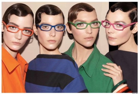
The image above is from the Prada 2011 Spring/Summer campaign. Interestingly, I think the argument behind this advertisement is that dressing in this way represents an expression of individuality and intellectualism. Each woman exhibit the same strong, symmetrical features and don a knowing gaze. The audience is given the impression that the women share a secret. In this sense the appeal of the image is exclusivity.
This image represents the contradiction that exists in fashion. While clothing and accessories appeal to people because they can express their individuality, at the same time, there are rules in fashion. These girls are in the know of the guidelines. The model's hand on the far right guards their well-kept secret and entrance into their elite class.
Each model is styled in an androgynous way. The clean lines of their structured outfits are not revealing. Their glasses frame unembellished eyes and their lips are nude. Their hair is elegant but distinctively masculine. Even their eyebrows are groomed but somewhat unkempt. The advertisement is undeniably masculine, but each of the women has consciously made a great effort to appear this way. Each outfit is colourful, but not playful or feminine, as one would expect for a Spring/Summer line. These outfits are fashionable, but noticeably functional, as well. The constructed image, or argument of this "dress code" is that of empowerment. The women are successful, powerful, and knowingly beautiful.
Subscribe to:
Posts (Atom)